HomeBlogA logo’s story: from a car to a ‘solid’ idea
A logo's story: from a car to a ‘solid’ idea
Every brand holds a story, an identity, a vision. The Prisma brand’s roots lie in a pivotal moment, both professionally and personally, for its founder, Silvano Ongaro. This moment gave rise to a business that has grown, evolved, and solidified over forty years.
Today, the Prisma logo is not just a graphic mark; it is a symbol that brings together a philosophy of technology, traditional craftsmanship, innovation, and a timeless design concept.
The origins of a name
The story of Prisma began in 1982. After 17 years as a technical and production manager at a metalworking company, Silvano Ongaro faced a radical career change. A period of uncertainty became an opportunity to create a new project, one built on extensive experience in steel processing and the courage to start from scratch.
The name for his new company came to him almost immediately during a car trip to Milan. “On the motorway, a car caught my eye”, the founder recalls. “It was a Lancia Prisma”. It was a simple name, yet rich with meaning. It seemed to condense the strength and solidity of stainless steel – the material at the heart of the company – while also capturing its ability to reflect light and transform it into infinite shades. “We couldn’t have found a more suitable name!”
The prism as a metaphor
The prism represents strength and solidity, but also lightness and transparency. Just as it has the power to break white light into a rainbow of colours, the company transforms stainless steel into a multitude of creative and functional solutions. This powerful image has since become a symbol and metaphor for the brand.
The company’s first logo was simple and direct: the name “Prisma” in a bright red.
This colour choice had strong symbolic value, as red expresses energy, passion, determination, and human warmth – values that have always guided Prisma’s vision and work ethic.
A mark that grows with the company
In the late 1980s, the company’s growth called for a redesign to reflect its dynamism. A graphic element was added next to the name: a stylised triangle representing a prism, which quickly became an integral part of the visual identity.
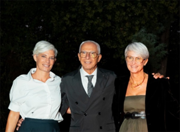
In subsequent years, with the entry of Silvano Ongaro’s two daughters, Paola and Anna, a new phase of evolution began.
This fresh energy was reflected in another logo redesign, this time entrusted to the agency White Red Green. They redefined the lines, making the prism more fluid, harmonious, and contemporary. It was a change that communicated innovation without breaking continuity with the past.
An identity that speaks of family
Today, the Prisma logo tells the story of the company’s solidity and its most authentic dimension: a family business where work is seen as a form of day-to-day care and attention. The triangular shape of the prism ideally recalls the three perspectives and three souls that guide the group, united in a single vision. This vision combines technology and craftsmanship, functionality and beauty, always keeping people at the centre.
Because ultimately, Prisma’s true strength lies in the humanity that animates the company – the bonds built with those who work every day to help it grow and with those who choose its solutions. It is a bond that is both solid and transparent, just like a prism.